An identity refresh can be the perfect time to gather your people and set out on a slightly new course.
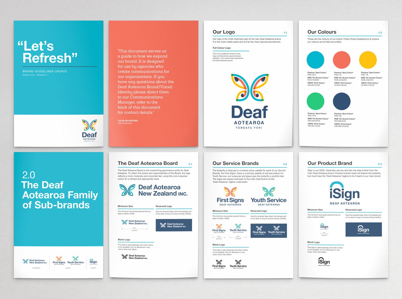
Deaf Aotearoa came with a brief to modernise their identity and ensure it reflected an organisation that wanted to energise its people and its messaging to the wider world. Consistency was also part of the brief – we were to review/audit all other logos, sub-brands and products that were used inside the organisation and bring them all under the Deaf Aotearoa master brand.
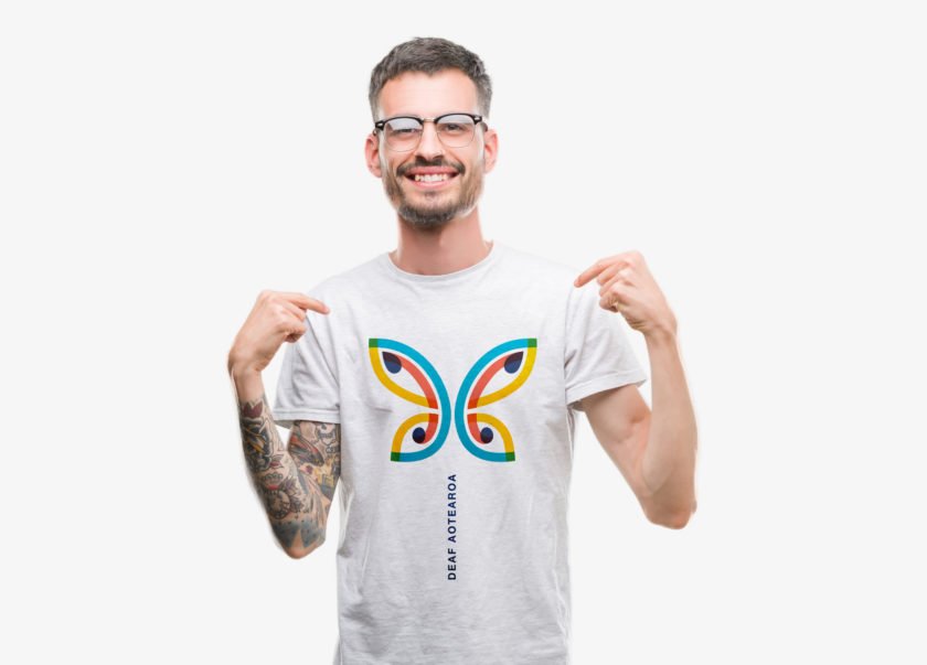
The original butterfly was loved by all and was to stay as the main ingredient. The deep connection with Māori was to be more overt, not just to appear in text but embraced with the logo mark as well.
A refresh of the colour palette reflected the optimistic island dwellers of Aotearoa – bright, young and contemporary.
Deliverables
Identity | Guidelines Document | Illustration
Involvement
Internal meetings | Design | Illustration | Guidelines Document